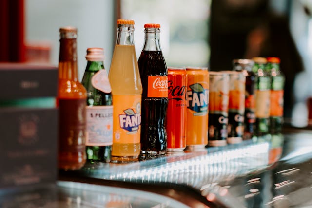
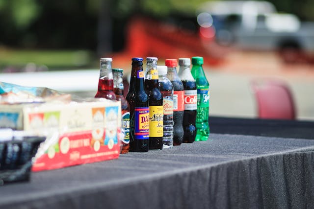
In a crowded retail environment, a product often has just a few seconds to catch a shopper’s attention. Long before ingredients are read or prices are compared, visual impression does the heavy lifting. Bottle labelling plays a pivotal role in this moment, influencing perception, trust, and ultimately purchasing decisions.From beverages and cosmetics to cleaning products and supplements, the right label can elevate a bottle from easily overlooked to instantly desirable.
First Impressions Happen at Shelf Level
When consumers scan a shelf, they are not reading — they are reacting. Colour, contrast, typography, and layout are processed almost instantly. A well-designed bottle label communicates brand personality and product value before a single word is consciously registered.Brands that work with experienced filling and packaging partners like Rentafill often understand that labelling is not just a finishing touch, but a strategic asset that supports shelf performance from day one.
Colour Psychology Drives Attention
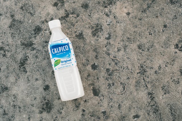
Colour choice is one of the most influential elements of shelf appeal. Bright, saturated colours tend to stand out in busy aisles, while muted or minimalist palettes can signal premium quality when executed well.For example:
- Greens and earth tones often suggest sustainability or natural ingredients
- Black, white, and metallic accents convey luxury and sophistication
- Bold primary colours can feel energetic, youthful, or refreshing
The key is not just choosing attractive colours, but ensuring they contrast effectively against neighbouring products on the shelf.
Typography Shapes Brand Perception
Fonts do more than display information — they express character. A clean, modern typeface can imply innovation and trust, while hand-drawn or serif fonts might suggest tradition, craftsmanship, or authenticity.Poor font choices, cluttered layouts, or inconsistent sizing can instantly reduce perceived quality. On the shelf, clarity and hierarchy matter. Shoppers should be able to identify the brand name, product type, and key benefit in seconds.
Label Materials and Finishes Matter
Shelf appeal is not purely visual — it is tactile as well. Matte finishes, gloss varnishes, embossing, and textured stocks all influence how premium a product feels when picked up.A bottle label with thoughtful finishing can:
- Encourage shoppers to handle the product
- Increase perceived value
- Reinforce brand positioning
In competitive categories, these subtle details often make the difference between browsing and buying.
Consistency Builds Recognition
Strong shelf appeal is not just about standing out once — it is about being recognisable over time. Consistent use of colours, layouts, and visual elements across product ranges helps customers quickly spot your brand among competitors.When labels are consistent yet flexible enough to accommodate new variants, brands benefit from both familiarity and freshness — a powerful combination at shelf level.
Clear Messaging Reduces Decision Friction
Even the most visually striking label can fail if it confuses the shopper. Shelf appeal is enhanced when messaging is simple, relevant, and easy to digest.Effective bottle labels clearly communicate:
- What the product is
- Who it is for
- Why it is different or better
Overloading labels with text, icons, or claims can overwhelm consumers and dilute impact.
Compliance Without Compromise
Regulatory requirements are non-negotiable, but they do not have to detract from shelf appeal. Skilled label design integrates mandatory information seamlessly, ensuring compliance while maintaining visual balance.This is especially important for products in regulated categories such as food, beverages, cosmetics, and health products, where credibility and professionalism are critical to buyer confidence.
Shelf Appeal Influences Perceived Quality
Shoppers often equate packaging quality with product quality. A polished, well-executed label suggests care, reliability, and attention to detail — all factors that influence whether a customer trusts what is inside the bottle.In contrast, poorly aligned labels, low-quality printing, or inconsistent application can undermine even the best product formulation.
Bottle labelling is far more than decoration
It is a strategic tool that shapes first impressions, communicates value, and drives purchasing decisions at the shelf. When design, materials, messaging, and execution align, labels become silent salespeople working around the clock.For brands looking to compete in crowded retail spaces, investing in thoughtful, professionally executed bottle labelling is not optional — it is essential.


